


|
Scooped by Martin (Marty) Smith |

Martin (Marty) Smith's insight:
Flat design is amazing. Looks good on mobile, is clean and easy to understand and hard to create. Here are 23 great examples.

Get Started for FREE
Sign up with Facebook Sign up with X
I don't have a Facebook or a X account


 Your new post is loading... Your new post is loading...
Martin (Marty) Smith's insight:
Flat design is amazing. Looks good on mobile, is clean and easy to understand and hard to create. Here are 23 great examples.

Marty Note
|
|
|
|
Scooped by Martin (Marty) Smith |
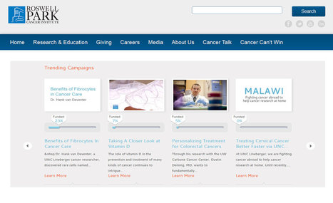
I'm involved in a very cool project right now called CureCancerStarter.org (http://www.curecancerstarter.org). This project is forcing the team at Atlantic BT to THINK about the future of web design.
We hinted at the "lean design" movement a few days ago in a Scoop (Designing for What If http://sco.lt/8nYdG5 ). Today we see how we aren't really designing websites anymore.
We are designing conversations.
The design example above embeds CureCancerStarter.org's trending campaigns inside of one of our cancer research partner's websites. Once the number of cancer research campaigns is more than 100 the best way to control and navigate to our content isn't on CureCancerStarter.org and that realization hit like a TRUCK.
We would be better served to NOT SCALE a new website but embed the campaigns back in the already scaled websites of our partners. We design the "crowdfunding cancer reserach" conversation and create the easy to plug in widget our partners can use to speak to their existing customers.
We started thinking the best approach was to create a new scaled commons (the Kickstarter or cancer research), and there can still be a "net the new fish" role for such a website, but the web is more and more about TRUST and trust doesn't come FAST or EASY.
Now we can see, given the current state of Internet marketing, why our jobs as web designers are changing. Instead of designing sites to scale we need to feed off of existing scale. When I started creating websites in 1999 no one had scale so everyone was equal.
1999 was before Google's decision to eliminate spam by elevating trusted sources. The problem is YOU CAN'T GET THERE FROM HERE. You don't have the TIME to work your way slowly up your business vertical's ladder. Instead you should be thinking about creating partnerships and widgets.
Design LESS and collaborate more will be our web design future.
Read more about my big V8 web design SLAP on G+: https://plus.google.com/102639884404823294558/posts/XHXxCn5qgEb

Design less and collaborate more. Interesting article about creating conversations into your web design.

From now on, all websites should be dynamic & collaborative. Constant work-in-progress, the same way we communicate or do things in real life. Static websites, however, are more like graveyards, some of them beautiful, but designed for tombs and dead anyway. With Dazib.com (soon to be released), we are working on an innovative solution for Web publication & "conversation"...


On this website you can learn a lot and that is very good.
To meet modern design demands, flat design must be mobile-functional, clean, and user friendly. Some examples here.