 Your new post is loading...
Smashing Perfect Sliders
Sliders, those moving images at the top of your homepage or other key pages, can be effective communication tools. They can also, when done badly, drive traffic into the night.
This Smashing Magazine "Perfect Slider" tutorial helps define when sliders are a good idea and how to execute them for conversion, not aversion.
2016 The Year of the Story
Storytelling may be the most important and least understood online marketing craft. This Curagmai post shares a 5 Tip "How To" craft a story working backwards from your landing page.
Tips included:
- Create A Landing Page and Work Backwards
- Place your offer in context
- Repeat 3 to 5 key brand specific themes
- Share your creation story
- Define your audience
http://www.curagami.com/online-marketing-5-storytelling-tips/
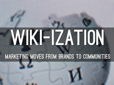
Here A Wiki, There A Wiki, Everywhere A Wiki
What is a Wiki if not an invitation to create online community. The "open source" like collaboration Wiki's provide is a blueprint for creation of online community. After months working on http://www.Curagmai.com we've discovered how close Wikis are to...well everything.
Wiki Ideas To Steal Include:
* Open Source Like Content Collaboration.
* Use community to steer and de-spam ecosystem.
* Depend mostly on social reward.
* A healthy and competitive contest never hurts. * Feature and thank contributors.
* Provide ways for contributors to know where they stand vis-à-vis other contributors.
* Create ways contributors can follow and communicate with each other.
* Include ways for contributors to create mini-tribes. * Make sure "rules of the road" are understood and published. * Communication with sponsoring agents must be easy too.
* Normalize greatness by sharing across ecosystem.
* Role of sponsors becomes more curators than creators.
* Ask for help.
* Provide social rewards (such as features) to contributors.
* Create ways to identify contributors in the world (t-shirts, stickers).
* Appreciate, be nice and thankful (always no matter what). Following a few simple rules will dramatically increase the most important content you can't buy (User Generated Content or #UGC) and build sustainable online community. Sustainable online community means costs go DOWN even as other material rewards (UGC, followers, traffic, money) go UP.
This Haiku Deck is about why we are all in the Wiki business whether we realize it or not AND how to design for the Wiki-ization of marketing, brands and online community.
Designing For Contests
I love home Homes.com doesn't kid around. They create CONTESTS not CONTENT. Why? Because contests have the added value of helping to create community too.
Erica Campbell Byrum How To Create Contests Video (start at 1:41)
http://sco.lt/6myquH VIDEO
Contest and games are FAVORITE engagement tactics because:
* They work (more new people come to play and share their playing).
* They are inexpensive WINNING is the main thing not the prizes.
* Contests have a LONG shelf life.
* Contests help unearth power Contributors and Social Supporters.
That last bullet speaks to the Gladwellian "Mavens, Salespeople and Connectors" tribes within your visitors. When you create a contest you will be visited by "contest trolls" and Ms. Byrum discusses how to deal with them in her video (link above).
This link is to Homes.com's Contest Page. This is a "Contest Splash" Page that shares the many simultaneous contests they run. I would add an ask for their "Blogger Ambassadors Program" too. They use contests to unearth their bloggers, but why not cut out the middle man and ask for those Ambassadors straight out?
Doesn't hurt to do both and I like have a page that explains the elite nature of our "buzz team". Don't think I'm saying Homes.com is missing it. They clearly GET the value of contests and you should STEAL the "ditch digging" design they do to "Splash Page" their contests.
Highly recommend watching Ms. Byrum too as her video is nothing if not comprehensive http://sco.lt/6myquH
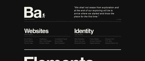
Depending on your brand and message some can be very professional and straight to the point, and others a bit more relaxed and playful. Here is a collection of taglines and intro messages from freelance designers and design agencies around the world for your inspiration.
Here’s a fun fact: Over the last 10 years, our attention spans have decreased from 12 minutes to 5 minutes. Our ability (and our desire) to read lots of c
A common misconception is that black is thought of as a color in the same way that red, blue, purple or even green are. In actual fact, black is the complete absence of all color...
Currently, one of the biggest trends in the web design industry is the flat design style. In case you are not yet familiar with the term, flat design is essentially design without the drop shadows, gradients, and textures that have been common in web design for some time. Flat design uses solid colors and often typography figures prominently into the design. In this post we'll showcase 33 excellent examples of the flat web design trend. Hopefully they can provide some inspiration that can be put to use in your own work. Buffalo
Putting emotion into web design may seem a strange concept, but many sites have been doing it for years, and we are only now beginning to recognize it and talk about it.
Via Brian Yanish - MarketingHits.com
Check out these 10 gorgeous websites to see what makes them so critically acclaimed.
Marty Note
Solid work here if somewhat on the heavy side for my taste. I do like Rdio. M
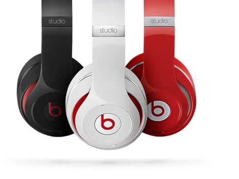
Beats By Dre Web Design Lessons
A friend shared the impressive NEWSJACK Dr. Dre and his Internet markeing team pulled off last week. Beats By Dre (http://www.beatsbydre.com ) has some cool web design tricks to steal too such as:
* Consistent images across channels (the Richard Sherman image rode the crest of the wave created by his "controversial" statements after last Sunday's game).
* HUGE RED BUY NOW Call To Action on the home page.
* Hero moves but does so SLOWLY so it isn't jarring.
* They've programmed their Richard Sherman page so his picture matches to every style, something I bet the site does for all celebrity endorsements (cool and NEW).
* Their social buttons are a little low for my taste, but they are well labeled as the "Beats Army" and every major social net is there and they are robust and fresh on all social nets.
* I like how they handle the colors too via the small swatches.
All in all a great ecommerce site in support of one of the best NEWSJACKS I've seen (see my notes on Dr. Dre's multi-channel attack of the web here: http://sco.lt/8bJiDJ
A free type resource, a voice against logo design plagiarism (finally!) and a travel site that works—these are just a few of the best website designs featured this month.
|
Building Online Community This Curagami post shares the 3 easy steps to building online community. This is not to imply building online community is easy since it is not. Winning hearts, minds and loyalty online isn't easy, but the steps you need to take are known and get easier as you practice, practice and practice failing in public more and more. * Ask for Help * Gamify * Fail in Public Rinse and Repeat. When in doubt go back to step #1. http://www.curagami.com/building-online-community-1-2-3/
Burn Down Your Website
As we noted on G+ (Inevitable Lightness of Being) websites are a tyranny few will be able to afford soon. Let's follow the rules of improvisation (always a good web marketing idea) and say, "Yes, and" to the issue of burning down your website. What are the web design implications of embracing the next generation of consumer marketing?
* Build for Curation Not Creation * Remember about THEM (customers) not you so build community in
* FAST, FLAT and FURIOUS
* Don't forget profiles, timelines and shares
* Read behavior THEN create the page (i.e. More Google-like)
Curation Not Creation
Friends @Scoop.itsuch as @Guillaume Decugisand @Marc Rougierare sitting in the cat bird seat. After the latest Google changes, and the last time we will know when Google makes algorithm changes, the curate don't create rule is strong.
Strong because you can't afford to put content on owned properties that isn't insanely great. In a world where the NY Times gets gigged for poorly supported content you need to test BEFORE you write.
Scoop.it is our favorite, "Test before you write" tool. Content curation is more democratic tool. Nothing like finding a cool post, sharing it and explaining why you think it is cool with rich snippets to create relationships. Doubt that? I have 45,300 followers on Scoop.it. Curate don't create and build your next site to make your curation easy, sticky and shareable.
Them Not You
One of the wooden stakes in the heart of tactical web development is it assumes too much control for the creators. As a creator I can attest where the power lives - THEM (your customers) not you. Your future web development needs to build community, make your curation of your user's content, the User Generated Content (UGC) every web miner needs to win today. If you don't have a plan to create user profiles, timelines and following better get one.
Fast, Flat and Furious (in Real Time)
If you haven't watched Joi Ito's TED talk about Nowism do so. The web only has one time - NOW. We've noticed anything we do, share, or create close to NOW does better. Figure the need to share and have content pinging (updating and being shared) constantly will be a huge need in tomorrow's web development.
Building flat and fast sites influenced by mobile's less is more philosophy is highly recommend. If your dropdowns are War and Peace novels you need to reconsider. EASY, simple and beautiful works better in a mobile, connected, and FAST world.
Profiles & More
Changing your role from creator to curator opens your thinking. If your site is about what THEY (your customers) do with it include them in your web design. Create profiles, timelines and make it easy for your customers to speak to and interact with each other.
Gamified and Predictive
No one gives things for long without reinforcement. We agree with Daniel Pink's great book Drive. Paying = jobs. Don't pay money, but do find ways to share your legitimacy.
Share your position and site and your community will help build it. Make sure to curate too. When you find great content THEY (customers) gave you, share and elevate the example everyone learns.
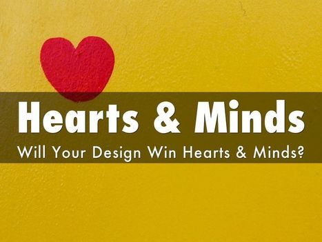
Web Designer SEO
Our SEO Tips for Web Designers hit a nerve. It is heading to 13,000 views (probably today). We hit a nerve because web Designers are where SEO rubber meets the road. This Haiku Deck is full of SEO tips for web designer including:
* Know who has the banana and why.
* Know how much SEO you need to know. * Learn what is MIST vs what is Gorilla.
* Listen Digitally.
* Understand how SEO & Content marketing work together. * Design to Win Hearts, Minds and Loyalty.
And More SEO tips designed for designers.
This article looks at some examples of interaction design in which smart interaction, defined by subtle animation, gently improves the user experience. We’ll share some lessons drawn from various models and analyze why these simple patterns work so well.
5 Quick Tips About Images & Web Design
Hard Won Lessons
I spent almost a million dollars of OPM (Other People's Money) learning these five lessons about images and web design, so lessons learned the hard way:
1. Portraits Are Powerful
Portrait images where the model looks directly at the camera, are powerful "welcoming" images great for home, about and category "splash" pages.
2. Babies are DYNAMITE - Use Carefully
Thanks to our ancient caveman brain we can't NOT look at babies. Problem is that is not a secret so babies are now overused to hock insurance, tires and shampoo. If you use a baby my preference is to have the baby looking AT something.
Visitors eyes go where the eyes of people (or babies) are looking, so point your baby image directly at an important Call-to-Action and bet your conversions go up.
3. People Talking To Each Other = DANGEROUS
There may be context where it makes sense for you to have an image where people in the image are huddled together, but I doubt it. If you have two people huddled and a third looking directly out at the camera the image works better.
We respect a huddle. We don't want to intrude, so your web image is working against your online marketing purpose. Your image says we are here having a conversation and YOU (visitor) aren't invited. Not a good idea.
4. People Sell Better Than Widgets, but...
I prefer to tell human stories even about the most widgety widget, but people bring "like me" problems too. Every visitor is looking for "like me" signals. If you know your archetype and tribe well enough to risk it use images of people consistent with your understanding.
If you have a wide variety of customers and members best to avoid single archetype "like me" images. This is yet another reason I like portraits. Portraits are "universal" meaning the welcoming look directly at the camera removes some of the "must be like me to engage" requirements.
5. In Action Shots Use The MOVEMENT
If your image is riding a bicycle POINT the movement at something important. I don't like movement images as heroes (largest images on a page is called a hero), but I love them in "sub-hero" images because movement creates excitement and allows me to direct the visitor's eyes where we want them to go.
Use these 5 hard won tips and your images won't fight your site's desire to connect, create community and convert visitors into buyers and members.
25 Great Web Design Tips From Forbes 1. The 5 Second Rule **
2. Proper Messaging 3. Call to Action **
4. Building Trust 5. Keep it Fresh 6. Incorporating Social Media
7. Don’t Make Me Think **
8. Web 2.0 – It’s About the User’s Needs, Not About You 9. Video **
10. Don’t Reinvent The Wheel 11. Don’t Fall Behind – Your Competitors Will Beat You 12. Security 13. Start with SEO in Mind **
14. Avoid Long Page Forms
15. Don’t Make Me Squint 16. Be an Industry Leader 17. It’s No Longer Just About the Desktop 18. Don’t Attempt to Target Everyone 19. Monitor Site Performance 20. It’s Web Pages, Not Websites That Rank 21. Your Website is a Component of Marketing 22. Good websites grow businesses. 23. Flash is dead. 24. Respect text. 25. Future requires wearable tech integration.
All 25 are great web design tips. Our favorite 5 are highlighted in bold.
The color white is simple, elegant and peaceful and the use of this color is seen in lots of websites. Whether they're portfolios or online shops, people agree on...
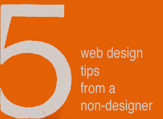
5 Web Design Ideas From A Non-Designer
Graphic Designers ROCK
I have more than tremendous respect and admiration for graphic designers. The ability to use tools like Photoshop and Illustrator to create MAGIC is something I will always envy. I know enough to know just how magical those skills truly are, so thank you.
I would LOVE to convince gifted visual marketers of the need to fix five mistakes I see over and over, mistakes that can HARM a websites bottom line and ability to scale.
I confess to making some of these mistakes myself. Easy to do when caught up in the NEW chase. I got so I printed out this list and keep it in view so it smacks me as a reminder while creating ideas for a new design.
Despite the list being omnipresent I forgot a subscription option on CrowdFunde.com two months ago, so EASY to forget these ideas:
** Email Subscription
Any websites lifeline is the LIST of supporters and subscribers they OWN. If Google changes their algorithm and PPC goes bankrupt you can always may your own list, so making sure the ability to opt in to that list is omnipresent is a CSF (Critical Success Factor).
** Keywords In Category Names
Think, "Do we want to win that keyword," when reviewing your navigation. You may select to have your URLs rewritten to be more keyword specific, but those internal links play an important role with Google's spider and SEO so KEYWORDS are a must.
** Research Keywords
My CrowdFunde co-founder Phil Buckley asked me if I thought attorneys or lawyers would be the most searched term. "Lawyers," I answered confidently knowing I was wrong (you never win these who will win questions lol). Attorneys is the winner and by a large margin. Don't write copy to what you THINK when it is so easy to do a little research and KNOW.
** The Tricky Part To Web Analytics
Here's the rub to web metrics. They operate in a constant seesaw dance with one another. Attorneys may be the most searched, but maybe that is because the Mass Tort guys have crushed the deck in some way (have no knowledge of that only using it as an example so please don't sue me lol). When you DESIGN with numbers you design better, but be sure to ask your SEO contact where the rubs are in the numbers. Rubs are numbers that LOOK one way but actually ARE another. Trust me you NEVER want to spend the kind of time in Google Analytics knowing where the rubs are requires, so ask.
** 80/20 Rule
One Internet marketing FRACTAL we discovered is 20% of the links, traffic, pages always get 80% or more of the value. Your job is to build a flexible framework so when your managing team SEES the emerging 80/20 rule you can easily shift the presentation to favor the 20 over the 80.
Now please take these practical, money making ideas and make them beautiful and THANK YOU for your dedication to BEAUTY in design and life :). Marty
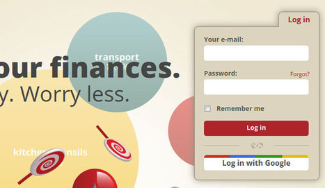
Social login, also known as social sign-in, provides users with one single login using an account they already have – their social network account.
Working with a team at UNC Emergency Room trying to make their website more engaging. As the BEFORE (on the right) image shows their current site "talks to itself about itself". Ways to fix that include:
* Hero image that heeds the sight line rule.
* Clear Calls To Action.
* Move Social from bottom left to upper right.
* Prominent Join Our List subscription form.
* Curate Customer / Patient content in (coming soon).
Your visitors' eyes follow the eyes of people in your photos. The image son the right show what NOT to do - make images that look like they are self referential. Never have people in an image on your site talking among themselves. Nothing says "we don't care about you" louder than images that are either too "smart", "exclusionary" or busy.
If people in your images don't look at the camera have their site lines pint to a Call To Action. Don't create ideas that are exclusionary either such as Leading, Teaching and Caring. That sounds like "selfspeak" to me.
OR, if you must have "selfspeak" then shore it with icons the way the UNC design lead did and use those icons to begin a conversation not a lecture about each of those ideas.
I LOVE text on a homepage for SEO, but it can be very exclusionary as the BEFORE image on the right proves. Tease the read with a few sentences and a "read more". BTW, the only time I use Read More CTAs is when I've teased something.
I prefer "learn more" since it feels more like we are learning together and less like work. Use closed loop CTAs when you are completing a proised action. All other times use CTAs that are more creative and fun.
The next step for this design, and the one that will make it really welcoming, is to curate in User Generated Content (UGC). When you include your customers (or patients in this case0=) you break down the THEM vs. US walls better than anything I can think of. Important to break down those walls since you need UGC and social shares to survive these days even if your have a .edu in your URL.
Visual language Lab: Researching the structure and cognition of the visual language of comics Marty Visual Language Important For Internet Marketing One undeniable trend is Lean Visual Marketing. We want videos and pictures and we want to understand complex ideas FAST. Scooplit is riding the crest of the lean visual marketing wave and exploding. We know that there are some core ideas in this new "visual marketing revolution" including: * Surprise helps but is had to create. * Smashing expected visuals into unexpected can create surprise. * Humor works. * Arresting visuals only work once UNLESS aligned to their content. * Without arresting visuals content marketing is doomed. * The "visual language" of your marketing must be consistent with all other marketing or dissonance results. I like the idea of studying comics to help achieve a sense of visual tone and for ways to connect images seamlessly with copy, tone ane theme.
Via Bucky Dodd
Cloud computing is one of the latest technologies that have come to change the way people interact with the web. Cloud computing accords you the chance to
|


![Make Web Designs Welcoming Don't Say Welcome via @Scenttrail [Before and After graphic] | Must Design | Scoop.it](https://img.scoop.it/HhOA-cUFV7ji5-jyEn3zXzl72eJkfbmt4t8yenImKBVvK0kTmF0xjctABnaLJIm9)
![What is Visual Language & How Comics Can Help Create It [graphic] | Must Design | Scoop.it](https://img.scoop.it/0RICjgYtoNqjfMSoHL5udjl72eJkfbmt4t8yenImKBVvK0kTmF0xjctABnaLJIm9)


Great, comprehensive, and illustrated "perfect slider" tutorial from Smashing Magazine.