Marty Note
Solid tips here with a few caveats:
* #3 printing is a nice to have now not a must have. Printing just isn't as important, but, for some, a printed piece is easier to share.
* Reviews are now more important in their absence. Having hundreds of reviews is great as it shows the size and value of the tribe formed around a given product. A Customer's voice is always a tad different sounding too, so be sure to curate content FROM reviews.
* High res images is a good idea, but don't slow the delivery of your page down. Use a Content Delivery Network (CDN) to help server your images and videos fast no matter who is looking at your content or from where.
* Product comparisons are great especially if they are social.
* Shipping = we would amend shipping to make sure your FREE Shipping triggers are easy to find / be aware of and set to maximize conversions.
E-commerce used to be static, Not So Much Anymore
This excellent Paper.li post from @Cendrine Marrouat - https://www.cendrinemedia.comshares interesting ecommerce research, design ideas and the impact of the social / mobile web on online commerce.
The new ecommerce requires originality, social curation and a supportive tribe as we discuss regularly at http://www.Curagami.com our Durham, NC based startup dedicated to creating cool new tools for online merchants.
“Designing your eCommerce store is not only about making it look good, but also making sure that it generates sales. Your goal is to make potential customers”
Martin (Marty) Smith:
These are great #ecommerce tips? My favorite and perhaps easiest fix for the most benefit is big, clear and creative CALLS TO ACTION.
In this article, we’ll walk through all of the vital steps when planning a highly converting mobile e-commerce website. The most important questions you need to ask are...
Martin (Marty) Smith:
Love the "ditch digging" specifics of this post. Mobile conversion seems mystery wrapped in enigma to me, so this post is beyond helpful.
Small design tweaks to an eCommerce website can make a BIG difference. Let’s take a look at what tweaks you can make to convert visitors into buyers.
Martin (Marty) Smith:
Like these tips and have used several of them as a Director of Ecommerce. My favorite is bread crumbs to clearly map the check out progress. The more "in flight" awareness you create smoother the landing (i.e. conversion).
...Did you know that color accounts for 85% of the reason why you purchased a specific product? Or that full-colored ads in magazines are recognized 26% more than black and white ads? The psychological elements go even deeper when you look at the specific meanings of colors. For example, if you use the color blue on your products, it will give your customers a calming effect…while black, on the other hand, gives your customers a sense of exclusivity. So, the real question that comes to mind is: how should you use color within your marketing?...
Martin (Marty) Smith:
Love honing in on conversion and color. We tested button colors often and it was conextually variable (so not easy). Helpful infographic.
Sending all traffic to a generic landing page can be a mistake for ecommerce owners. Remember that shoppers who found your store via paid search are different from those who ...
Martin (Marty) Smith:
Landing pages are mostly thought of as B2B capture pages, places relationship SaaS sellers gather names to convert later. A product page is another name for a B2C landing page and tools on this list can help B2C or B2B teams create better (i.e. higher converting) landing pages.
North Carolina Museum Of Art and Art of Internet Marketing
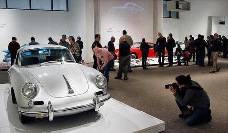
Kudos to whoever is managing the digital marketing team at the North Carolina Museum of Art (NCMA). I got a nice tweeted thank you for my Wall Street, Texans and a Thief story about the Porsche By Design exhibit (http://sco.lt/6mfIMD ).
I visited Porsche By Design yesterday as I attempt to wander my way through the CrowdFunde business plan, but that is another story. NCMA's web team included a Win A Porsche raffle (so a viral contest) and some of the most amazing pictures of cars I've ever seen. KUDOS!
The didn't include the picture above, but I wanted to take a moment and share Internet marketing image tips learned during my 7 year Director of Ecommerce tenure. The picture above makes a great HERO (largest images on webpage are called 'heroes") because:
* High contrast (white car with red car in immediate background).
* Action since the photographer is focusing and people are milling.
* People milling create interest. Note how none of the "milling people" are looking AT the camera so they don't distract since we would follow their eye sight lines if they were looking at the camera).
* The milling crowd moves out and then back into the white car because of the way the RED CAR is pointed (brilliant again).
* The car becomes a huge POINTER, so putting a CTA (Call-To-Action) under it would get lots of clicks.
* The photographer becomes a pointer too since many would click anything immediately below him. * Gaze follows the photographer’s camera and the sight lines of people in the picture (note the guy LOOKING at the photographer who is focusing on the car = BRILLIANT).
This photograph is GEINUS since it creates excitement, provides amazing pointers that would direct visitor eyes to Calls-To-Action and its basic color, high contrast would work well within any web design.
My question is are you thinking about your hero images this deeply? If not you are NUTS since serendipity is not a scalable Internet marketing strategy (lol). Quick tips for Heroes:
* Remember to look for pointers that will direct your visitors’ gaze.
* We look at PEOPLE more than things.
* We also look WHERE people are looking.
* We really LOOK at babies, but same rules apply (we look where they look).
* The direct gaze at the camera is welcoming and creates engagement. * Two people talking heads turned away is a disaster (excludes visitors).
* Don't over use the direct gaze idea.
* Crowds can work, as they do here, but be aware that visitors will follow their sight lines too.
* When people's sight lines aren't available we look for and find other directional clues.
This last bullet is the real RUB of using images on your website. THINK about how any image moves visitors to the next step. Images (and video) can help or hurt your website's goals. Follow these simple tips and images will HELP move visitors to subscribers, contributors, advocates and buyers.
According to a study from Adobe, in 2012 repeat shoppers made up just 8% of all site visitors in the US yet they accounted for nearly 41% of total online sales.So bearing in mind the fact that it’s also cheaper to keep a customer than it is to attract a new one, businesses need to be working hard to keep shoppers satisfied and give them a reason to return.With this in mind, I’ve rounded up 11 ways in which ecommerce retailers can improve customer retention....
Martin (Marty) Smith:
Easier to make more money from customers already acquired and almost no website pays much aattenton to thst idea.
Here are tips on how to improve your ecommerce website's UI to encourage repeat visits. I would ad DOD (deal of the day) which seems to be gaining momentum and macro categorization for your your personas. At this time of year havig a For Him, For Her, For Kids is good macro categorizaton.
There are seven steps to the consumer buying decision process. It’s up to marketers to stimulate consumers to go through each step and become advocates.
Martin (Marty) Smith:
I don't think the web buying funnel is this linear. I think people loop out and in to each of thse stages a little more randomly and in response to stimuli (like great offers or email marketing),but not a bad illustration of how visitors become buyers.
Read this excelllent David Edelman post from HBR about Branding In A Digital Age for more on how I think today's buying funnel works:
http://hbr.org/2010/12/branding-in-the-digital-age-youre-spending-your-money-in-all-the-wrong-places/
Email is alive and well as a proven inbound marketing channel, and converts better than both search and social. Find out how to increase conversions from email marketing with proven methods used by...
Martin (Marty) Smith:
So much talk about how Email Marketing is FAR from dead in my most recent Scoops I thought it a good idea to revist this excellent infographic from Monetate.com.
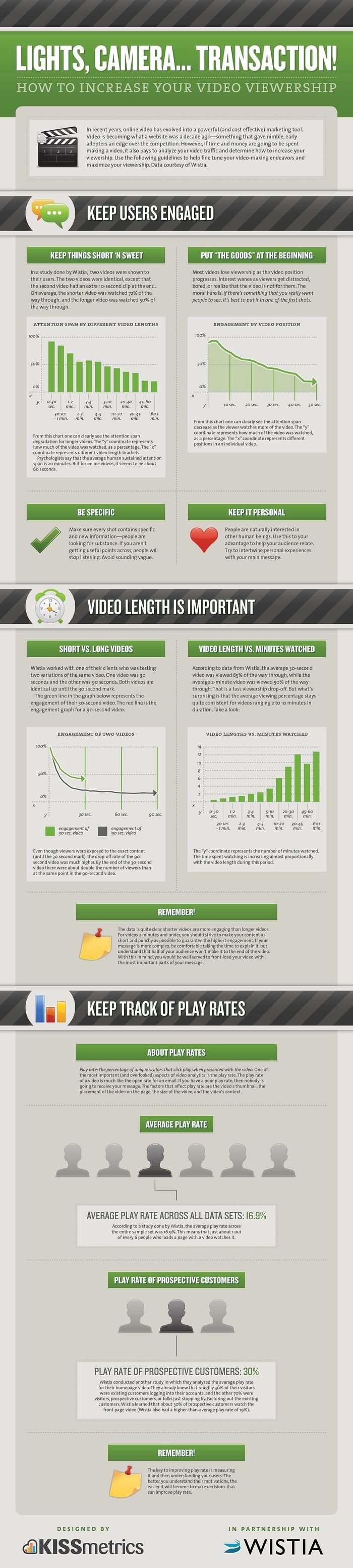
In recent years, online video has evolved into a powerful marketing tool. Use the following guidelines in this Infographic to help fine tune your video-making endeavors and maximize your viewership.
Martin (Marty) Smith:
Great infographic on increasing video stickiness from KISSmetrics. Video is a powerful tool for an ecommerce webstie, but beware. Video is so engaging it can lower conversions. Follow outline in this KISSmetric infographic to INCREASE conversions.
Scott Mason is our excellent local CBS affiliate WRAL's Tar Heel Traveler. Scott interviewed me yesterday for our Cure Cancer Starter video and I agreed to take a look at his website to say THANKS.
This post is about why "web design" is a dangerously vague term now and why sometimes creating a website that works is about the money or about finding experts capable of making money online to help create your online presence.
Martin (Marty) Smith:
The Tar Heel Traveler Website
Scott Mason is an amazing visual storyteller. He creates "slice of life" pieces for our excellent local CBS affiliate WRAL TV. You can watch Scott's videos by clicking on the link below:
The Tar Heel Traveler on WRAL Scott wrote a great book about a year ago on his travels across North Carolina. The book has been a big hit selling several thousand copies (this is very unusual, most books only sell a handful of copies). Scott created a website to support the book:
TheTarHeelTraveler.com
The Magic Math of Making Money Online
There is a large group of "web designers". There is a smaller group of Internet marketers that know how to design a website to matter more and more every day. Finally this is a TINY SET of Internet marketers that really know how to make money online.
That third set can't be larger than a few thousand people in the world. I've managed teams that have made millions online, but my talent is in recognizing the kind of skills and minds necessary. I know how to create a team that feeds off each other, teams capable of creating websites that matter more and more and so make millions.
I haven't met the designer who created TarHeelTraveler.com, but they made many unforgivable mistakes including:
* Site doesn't have social support.
* No blog (Scott is an amazing writer).
* Title is poor and they are poor throughout. * Conventions such as "HOME" is violated (welcome instead). * Visuals could be better. To the designer’s credit the site was created in cascading style sheets and it loads fast, but those benefits don't overcome the site's significant issues.
The lack of social support is, at this time, is unforgivable. The site has a PageRank (PR) of 2 and that is only because WRAL is driving a PR5 into it. This website design has NO CHANCE to scale or matter much. I just wrote a note to Scott explaining that this site in 2002 or 2003 might have worked; now a website design like this is dead on arrival.
Platforms Vs. Websites
I wrote a piece on the death of the "closed loop" website, a website such as TarHeelTraveler.com that is talking to itself about itself, in 2011. Platforms vs. Websites is about changes created by social and mobile (sometimes called SMobile).
The GOOD NEWS is you can use OPP (Other People's Platforms) to help create social websites. I suggested Scott use Flickr and YouTube, but he could also use Scoop.it, LinkedIn and Shopify. We don't have to look far to see the rise of User Generated Content (UGC) platforms such as Amazon, Facebook and Twitter.
UGC Is the secret weapon of all platforms, we all know this by now. Tough part is UGC is getting harder and harder to generate since it is in such clear demand. The Tar Heel Traveler has a built in demand. People want to share stories, pictures and video about a well-loved and visited state.
This means Scott only needs to ASK for UGC, use a few free tools and his PR2 becomes a PR5 in no time. The other big learning is there may be many "web designers", but there is a tiny group that really knows how to create platforms that matter more and more every day. Many are called, few are chosen.
A couple of tips for a clean online store design with some inspirational examples of minimal e-commerce sites.
Martin (Marty) Smith:
I'm in favor of ANYTHING that helps customers move toward a conversion point faster. This is my favorite line from this post about clean ecommerce store designs:
More and more companies are ditching lots of color, models and movement on their websites in favor of more minimal design schemes.
I attribute this "simple is better" trend to the strength of A/B testing. The more testing you do the more simple your pat to conversion becomes (it is inevitable). Good Ecom design tips here for 2013.
Internet marketing isn't what you think. This post explains why top converting sites convert at many times typical 4% to 6% and how your website can too.
Martin (Marty) Smith:
Internet Marketing Isn't What You Think It Is
Wrote this piece yesterday explaining the difference between highly converting websites and everyone else. I haven't figured the average conversion rate of these ten sites, but Schwan's is #1 at 42% of its traffic.
If your ecommerce website is struggling to reach 6% conversion (as mine did), STEAL from these Top 10 Converting Websites.
Online Store for Seidio, one of the world's leading developers and manufacturers of smartphone accessories and enhancements that enable users to utilize their devices to their full potential.
Martin (Marty) Smith:
Never Forget The ScentTrail
Arriving at the linked category page showing iPhone 5 accessories from this Tweet:
@seidioseidio We're excited to announce the most exciting #iPhone5 accessory of the year - OBEX. http://bit.ly/iPhone5OBEX #waterproof
feels like a bait and switch. Baiting and switching online is when you set one hook, The Most Exciting iPhone 5 Accessory and deliver another a simple product dump page generated by a search query (note the top of the page).
Don't get me wrong, as a former Ecommerce Director, I used search query generated landing pages all the time. The problem here, the "MUST AVOID" is the lack of scent trail on the landing page.
When you set such a great hook as the most exciting X, then greet me with a repeat of the hook. The irony is THEY THINK THEY DID THIS.
Seidio thinks they created scent trail with OBEX and #waterproof. Not so much. I don't know the brand OBEX and I only connect waterproof to the "most exciting" claim NOW. The hook was so great I wanted to see the answer on the landing page.
Easy to solve this problem through repetition and a graphic. When you make a claim and an award such as "most exciting" that is best communicated graphically.
If Seidio wanted to create scent trail without changing anything about the way they are generating this landing page all they needed to do was badge the product images with a "MOST EXCITING 2012" graphic.
Conversion is hurt when you forget the scent tail. One of the most damaging things ecommerce merchants do is to make great claims and then NOT sufficiently explain the claim.
I've been in the 4Q tornado and know what happened. Seidio looked at this idea and thought we could get it BECAUSE they got it. Ah if that were the way it worked (lol).
When your ecom team creates a great hook like MOST EXCITING make sure they don't drop the ball on the goal line by not including a support scent trail.

Excerpt from the article: Let’s get started with our step-to-step guide for creating SEO landing page (that converts! Step 1: Set your landing page goals
Step 2: Develop Search Personas
Step 3: Create content with search personas in mind
Step 4: Arranging the layout of your SEO landing page
Step 5: Keep the most important element above the fold
Step 6: Use Pictures to Boost Conversions
Step 7: Make Use of Videos
Step 8: Be persistent with your call-to-action
Step 9: Leverage Testimonials
Step 10: Use Heatmaps to easily identify the focal point areas
Step 11: Write effective headlines to drive traffic Curated by Agostino Caniato:
http://bit.ly/Landing-Page-World To deepen the points just mentioned read the full article here: http://bit.ly/RnDayH
Marty Note
Don't usually think of SEO "landing pages". Usually use "landing pages" to describe where paid traffic lands, but the distinction is lost when traffic and its origins are becoming as murky as it is now. Semantics aside this ariticle is full of some of my best tricks including personas, pictures and CTAs (call-to-actions).

I selected this article from copyblogger because it delivers, it's simple, straightforward and right on the money! Here's an excerpt: "I believe a story can potentially carry the entire sale for your product, even if everything else is technically “wrong” in your ads ** no clear call to action **lame bullets **weak offer For example: "Nothing in the movie "Top Gun" told you to buy Maverick’s brand of sunglasses or join The US Navy. Yet, the movie “sold” both products to hordes of people. **So, how do you apply this to your marketing? 1. The personal story
This is one of the most common landing page stories. **This one is simple — you just “walk” people (step-by-step) through a painful problem you went through and how you achieved the result your readers are looking for. 2. The historical story **This kind of story is extremely persuasive, contains nothing even remotely resembling “hype,” and can persuade people to buy things they otherwise might ignore. 3. The “meet the guru” story
**This one is related to the personal story, but it’s got more “pop” due the built-in credibility it gives you. **These suggestions have proven to produce results, he gives more examples...... Curated by Jan Gordon covering "Storytelling, Social Media and Beyond" Read full article here: [http://bit.ly/yVmlNV]
**** Recently appalled at how little copy was on maor ecommerce sites I was reviewing this articles seems prescient and important. Marty
|
Scoop it Creator
Martin (Marty) Smith
FOLLOW US
|