 Your new post is loading...
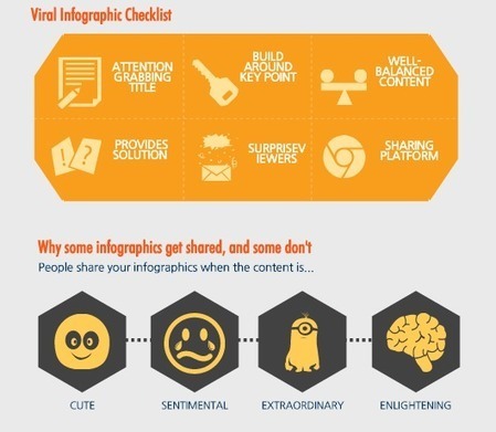
Sharing your infographic online is no different. There are hundreds of thousand of infographics out there. In fact, if you search the term “infographics” in Google over 43 million search results populate. Everything from the latest blog post about infographics (like this one) to different tools and programs you can use to create an infographic appear in search results.So, how do you get your infographic to not only show up, but be shared across networks? Follow the below five steps, do even more research than necessary, and begin your road to virality....
Via Jeff Domansky
In an effort to keep your Twitter manners properly set up and to make sure you know which part of Twitter is useful for a particular type of question or conversation, check out this visual guide.
Via Gust MEES
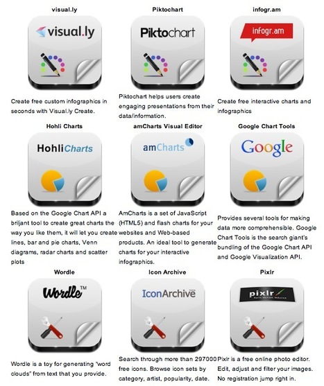
Robin Good: Here is a handy short guide to nine free infographic creation tools that can be utilized to create enticing visuals, word charts and data-based infographics without having special technical skills. Useful. 8/10 Check them all out: http://www.infographicsarchive.com/create-infographics-and-data-visualization/ ; (Unearted by Andres Taborga) Hey All -- sometimes in business we need to display/convey data with our storytelling. So how do you display data in engaging ways? I love this article because it shares 6 free tools to use, plus there's a little tutorial on how to make infographics. We all know how important it is to have the right tool for the job at hand. Bookmark this article so when you need the tools you have them. Enjoy playing with your numbers and showing them in different ways! Thank you Robin Good for curating this article.
Via Robin Good, J Lynn Lock
Top 10 Curation Revolution Scoops Of All Time
Let's look at Brain Essential Learning Steps. In other words, how does the brain process information in the learning process
Via Gust MEES
Whether you own a large online business or a small booming startup, we’re sure you are actively using social media to give your brand the right dose of exposure and get the message across to your targeted audience. This is a great list of useful cheatsheets for people who want to benefit more from social media marketing. These 35 cheatsheets cover tips for Facebook, Twitter, Google+ and Pinterest, so you can better understand how to market via social media and how to design pages and content for optimum exposure.
Via Lauren Moss, Brian Yanish - MarketingHits.com
Infographics are changing the way we share information, so we thought it would be a good idea to gather 12 essential ones that would help marketers and businesses understand what’s currently taking place in the online world as well as make better use of the tools we have at our disposal.
Via Lauren Moss, Antonios Bouris
A massive survey of internet users reveals trends in social media usage across numerous platforms, ages, races, genders, population density and which social media sites do they frequently visit. The Pew Research Center has released the results of a comprehensive social media survey, conducted over several years to evaluate which demographics were using social media, and on which platforms. Which social networking sites emerged on top? Of the online adults surveyed at the end of 2012: 67% use Facebook 20% use LinkedIn 16% use Twitter 15% use Pinterest 13% use Instagram 6% use Tumblr A decent amount of Americans appear to be using social media, but which demographics use social media in greater numbers? It appears that women use social media 9% more than men do, at a whopping rate of 71%. Other frontrunners with the highest social network activity in their demographic include city dwellers(70%), Hispanics (72%) and adults with a household income below $30,000 annually (72%). The most pervasive and consistent divider amongst social media users remains, unsurprisingly, their age. 83% of the young adult demographic (18-29 year olds) use social media, which is well over double the activity of online adults over 65 years old (32%).
Via Gust MEES, roberto toppi
Today's infographic is about the AlienVault Open Threat Exchange or OTX, which is a multinational effort to aggregate, and disseminate the fingerprints and forensics of the latest cyber attacks. The infographic is full of statistics on malware, hack attacks and such.
Via Gust MEES
Do you know the difference between contemporary and traditional learning and teaching styles? This handy chart breaks it down quite well.
Via Gust MEES
|

|
Rescooped by
Gerrit Bes
from MobileWeb
|
There had been several articles written linking mobile usage to e-commerce and why marketers need to not only optimize their campaigns to look good on mobile but actually put mobile and social at its center. In this article, we will explore more on the psychology as to how people use their mobile phones, what exactly are they browsing (compared to what they already do on the desktop) and what types of products and/or services they purchase through their phones. Source: http://ijustdid.org/2013/12/why-mobile-commerce/
Via Brian Yanish - MarketingHits.com
Don't have hours to spare crafting something beautiful in Photoshop? Sarah James of The Infographic Design Company selects 8 tools that won't cost you a penny...
Via Gust MEES
|
|
Scooped by
Gerrit Bes
|
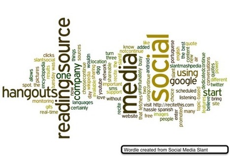
Pretty cool picture, eh? I made it with Wordle. Wordle is a free website that allows you to make your written content shine by turning it into word clouds for presentations, articles, and more. No ...
This handy visual guide explores technology use by young children. How much and what do they use, and is it appropriate?
Via Gust MEES
Virtual private networks, or VPNs, allow people to send and receive data over a public network as if they were connected to a private one. VPNs allow people to protect their internet data while using public networks.
Via DashBurst
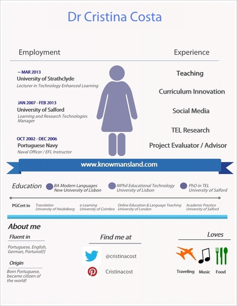
To illustrate the previous full video on teaching, learning and doing research via social media in a university setting, here is an Infographic on Christina Costa.
The website also links to her PhD thesis: The participatory web in the context of academic research : landscapes of change and conflicts
I just developed an infographic on my experience using easel.ly It doesn’t look as great as I’d like – need to improve my design skills!! – but this was pretty easy to create.
A great way to illustrate one’s experience.
Via Deb Nystrom, REVELN
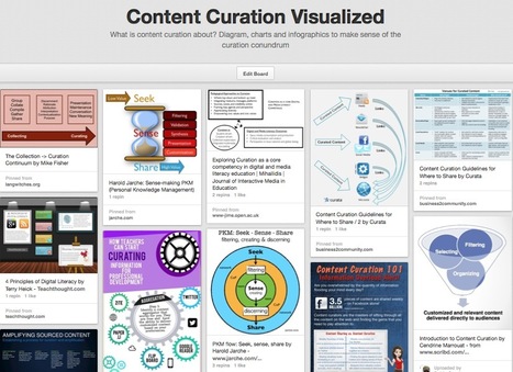
What is content curation about? Diagram, charts and infographics to make sense of the curation conundrum
Via Robin Good
Infographics are interesting–a mash of (hopefully) easily-consumed visuals (so, symbols, shapes, and images) and added relevant character-based data (so, numbers, words, and brief sentences). The learning application for them is clear, with many academic standards–including the Common Core standards–requiring teachers to use a variety of media forms, charts, and other data for both information reading as well as general fluency...
Via Baiba Svenca, Gust MEES
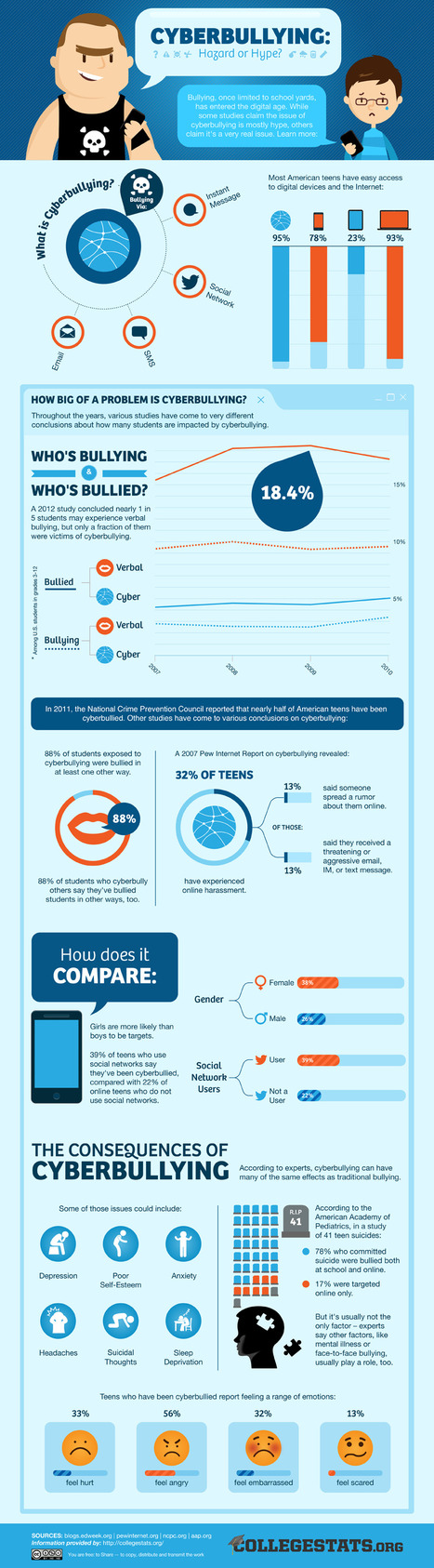
From harassing text messages to demeaning social network comments, teens face a barrage of all-too-common digital bullying tactics in today's world. But is
Via Gust MEES
This March Madness-themed infographic uncovers key information on search privacy concerns, social influence, efficacy of images in search results, social sharing behavior, social preferences by social network and demographic, and more.
Via Gust MEES
There are many reasons we use social media. From the basic to the more advanced, the tool is simply ubiquitous and addictive. This infographic sheds some light for us all.
Via Gust MEES, ABroaderView
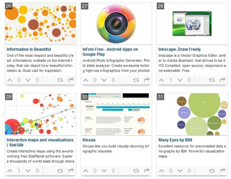
Data is everywhere and well-designed data graphics can be both beautiful and meaningful. As visualizations take center stage in a data-centric world, researchers and developers spend much time understanding and creating better visualizations. But they spend just as much time understanding how tools can help programmers and designers create visualizations faster, more effectively, and more enjoyably. As any visualization practitioner will tell you, turning a dataset from raw stuff in a file to a final result in a picture is far from a single-track, linear path. Rather, there is a constant iteration of competing designs, tweaking and evaluating at once their pros and cons. The visualization research community has recognized the importance of keeping track of this process. Read the complete article to learn more about the future of the practice and the tools that enable designers to create thoughtful infographics and visualizations...
Via Lauren Moss, Antonios Bouris
|


![The Must-Have Guide To Twitter Manners [Infographic] | Latest Social Media News | Scoop.it](https://img.scoop.it/lSKgx5hyc6DMOVoCmuyM1Dl72eJkfbmt4t8yenImKBVvK0kTmF0xjctABnaLJIm9)


![The 4 Brain Essential Learning Steps [Infographic] | Latest Social Media News | Scoop.it](https://img.scoop.it/I-CVr-iI4FkrBUPd0a2xqDl72eJkfbmt4t8yenImKBVvK0kTmF0xjctABnaLJIm9)


![Survey Reveals Which Demographics Use What Social Media [INFOGRAPHIC] | Latest Social Media News | Scoop.it](https://img.scoop.it/VBS6HsZXHojuGRBmt_vG6Tl72eJkfbmt4t8yenImKBVvK0kTmF0xjctABnaLJIm9)


![Why Cyber Security is Important [Infographic] | Latest Social Media News | Scoop.it](https://img.scoop.it/pUS0ooiVVSwZ2nE_dNh3Vzl72eJkfbmt4t8yenImKBVvK0kTmF0xjctABnaLJIm9)


![The Difference Between Contemporary And Traditional Learning [Infographic] | Latest Social Media News | Scoop.it](https://img.scoop.it/b8VT50AeOzQHxDC2aci21Dl72eJkfbmt4t8yenImKBVvK0kTmF0xjctABnaLJIm9)
![20 Reasons Why you Should Use Google Plus [Infographic] | Latest Social Media News | Scoop.it](https://img.scoop.it/j1fJ08aqSCOFcw0g2J6fxjl72eJkfbmt4t8yenImKBVvK0kTmF0xjctABnaLJIm9)


![[Infographic] Top Scams on Facebook | Latest Social Media News | Scoop.it](http://www.bitdefender.com/site/ResourceCenter/infographic/6_bitdefender-infographic_facebook.jpg?rf=rclisting)

![Mobile Commerce – What People Browse, Buy and Why? [INFOGRAPHIC] | Latest Social Media News | Scoop.it](https://img.scoop.it/egGnidBS_uQCgl_PgUHbLTl72eJkfbmt4t8yenImKBVvK0kTmF0xjctABnaLJIm9)


![The Complete Visual Guide To Technology For Children [Infographic] | Latest Social Media News | Scoop.it](https://img.scoop.it/VACeOq2pQXj-ld6-oGZImjl72eJkfbmt4t8yenImKBVvK0kTmF0xjctABnaLJIm9)

![Virtual Private Networks in the US: Where Should You Be Most Concerned About Your Online Privacy? [INFOGRAPHIC] | Latest Social Media News | Scoop.it](https://img.scoop.it/Uiz-dRpTYZGXSZh2lNC_iTl72eJkfbmt4t8yenImKBVvK0kTmF0xjctABnaLJIm9)


![Social Behavior: The Big Game [INFOGRAPHIC] | Latest Social Media News | Scoop.it](https://img.scoop.it/xxbj2GMUUgS29Bc9sY2M4jl72eJkfbmt4t8yenImKBVvK0kTmF0xjctABnaLJIm9)
![5 Reasons We Use Social Media [Infographic] | Latest Social Media News | Scoop.it](https://img.scoop.it/0dX8Ctv2ZvgMgSGXFog8zzl72eJkfbmt4t8yenImKBVvK0kTmF0xjctABnaLJIm9)


aggiungi la tua intuizione ...
559