

Infogram is an easy to use infographic and chart maker. Create and share beautiful infographics, online reports, and interactive maps. Make your own here.
Via Tom D'Amico (@TDOttawa)
Get Started for FREE
Sign up with Facebook Sign up with X
I don't have a Facebook or a X account


 Your new post is loading...
 Your new post is loading...
Your new post is loading...
 Scoop.it!
Infogram is an easy to use infographic and chart maker. Create and share beautiful infographics, online reports, and interactive maps. Make your own here. Via Tom D'Amico (@TDOttawa) 
No comment yet.
Sign up to comment
Scoop.it!

This is the most shared, visited and viewed post on Design Revolution. December is always HOT for trend predictions. Interesting to look over December's predictions to see if they are coming true: Via Martin (Marty) Smith

Amanda Groover's curator insight,
December 15, 2013 10:43 PM
Marketing in this decade not only needs but REQUIRES the ability to think outside of the box! Look at some of the trends appearing in a marketing campaign near you in the next year! 
Jakarta Web Developer's curator insight,
August 11, 2014 5:15 PM
Web and Graphic Design Trends 2014 – Infographic via istock (Midyear Check) 
Alfredo Corell's curator insight,
August 12, 2014 3:06 PM
Interactive infographic:
Scoop.it!
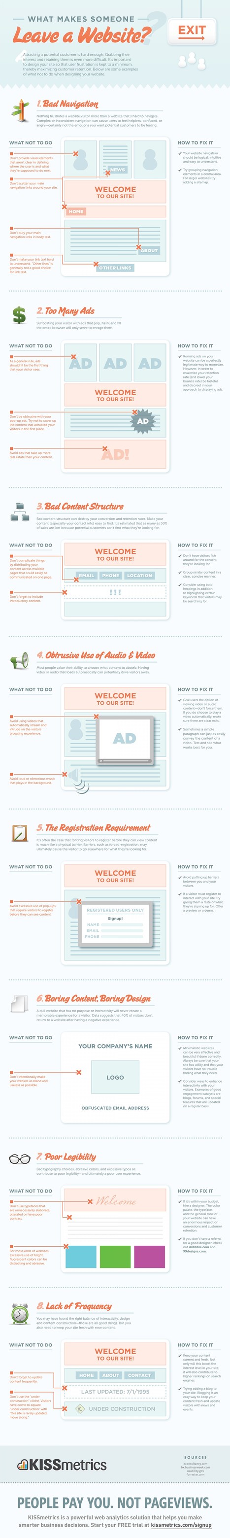
Attracting a potential customer is hard enough. Grabbing their interest and retaining them is even more difficult. It's important to design your site Via Martin (Marty) Smith, Michael Allenberg

Martin (Marty) Smith's curator insight,
November 9, 2013 9:57 AM
Of these 8 very deadly sins the most deadly in my experience is the first one. When customers don't know where you want them to go and what you want them to do or where they came from (within you site) they get confused. Confused customers do many things buying is never one of them. 
Michael Allenberg's curator insight,
November 13, 2013 7:36 PM
An info graphic about UX... WIN WIN!!! 
Louise Robinson-Lay's curator insight,
November 15, 2013 3:53 PM
More on great design for maximum impact. This time, websites.
Scoop.it!
![Color Is Master Of Us All: Color Preference By Gender [Infographic] | Rapid eLearning | Scoop.it](https://img.scoop.it/USFIxAcBv1MQMITgJK_9RTl72eJkfbmt4t8yenImKBVvK0kTmF0xjctABnaLJIm9)
From the day that babies are brought home and cradled in their pink or blue blankets, implications have been made about gender and color. Let's take a look at what they say about color and gender. Via Martin (Marty) Smith
Martin (Marty) Smith's curator insight,
May 19, 2013 4:15 PM
Find first Color Is Master of Us All Infographic here: http://sco.lt/7FcZ4T
Scoop.it!
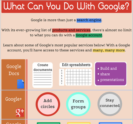
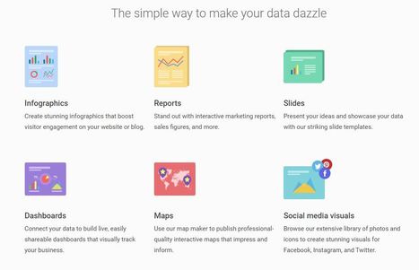
Are you aware of the many services that Google offers? This infographic, from the Goodwill Community Foundation (GFC), provides a look at some of the services. In fact the GFC website provides a wide range of materials that you may find useful. This infographic is a part of a lesson that teaches you about many of the services Google provides. Via Beth Dichter
Scoop.it!

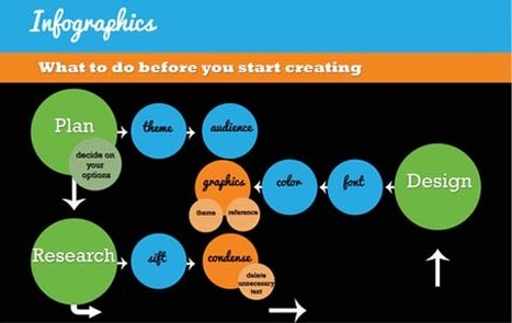
Even if information is highly out of ordinary and attention-grabbing, if your content contains lengthy plain text without illustration or images whatsoever, the entire page becomes dull and unimaginative. To sort this out, infographics help in routing information in a creative manner and in a style making your information easier to understand. In a nutshell, infographics are visual representations involving data with applied design and style aspects to display written content. In forms of images plus text, some charts and other friendly resources, they extend the content of articles, usually of statistical data, and increase familiarity of readers in a way that elevates their comprehension. In this article, we will tackle how you can design effective infographics for your blog... Via Lauren Moss
|
Scoop.it!

Is your website ready for 2015? Here are 5 of the new trends to look out for in the coming year. From Mobile Focus, Interactive, Flat, Simple, and Single Page Designs – stay ahead of the curve and get on trend for the New Year. Our easy to follow visual guide will show you the way. Via Lauren Moss, Alfonso Gonzalez

Tony Guzman's curator insight,
January 29, 2015 9:55 AM
This infographic shares five trends in web design for this year. 
Scott Wachtel's curator insight,
March 13, 2015 4:05 PM
Major points are spot on. if you're not optimized for mobile reach you are limiting your exposure and potential income.
Scoop.it!
![6 Best Practices of Responsive Web Design [Infographic] | Rapid eLearning | Scoop.it](https://img.scoop.it/GEiP8AlElwKVA2cIR8IpFDl72eJkfbmt4t8yenImKBVvK0kTmF0xjctABnaLJIm9)
Responsive design for a website is often used in the context of mobile users. Given the fact that more and more users are using mobile devices such as their smartphones and tablets to access the web, both for browsing and otherwise, it is extremely important that website designs become responsive towards all devices and screen sizes. Find more advantages, benefits and best practices of responsive design at the infographic and article link. Via Lauren Moss, Boyé

Massimo Petrucci's curator insight,
April 22, 2014 4:27 AM
Interessante infografica che mostra le dimensioni ideali degli oggetti web e delle immagini quando si progetta un template resposive. 
Mr Tozzo's curator insight,
April 23, 2014 5:42 AM
6 Best Practices of Responsive Web Design [Infographic]

Pallab Kakoti's curator insight,
April 24, 2014 4:56 AM
Responsive designs are the window into the future of web portability to drive higher per user engagement by embedding the concept of Probability Scores. An aggregate of Content Scores & Engagement Scores are debated prior to finalizing which sections gets a higher Probability Score that will eventually determine content position in the responsive design layout. Probability Scores aims at achieving better per user click through rate owing to its full width auto adaptive content display interface that adjust the landing page content based on the device.
Earlier websites used to feed different URLs for different devices. For example m.sitename.com or mobile.sitename.com indicated that the URL is for mobile or smart devices. But now things have changed thanks for responsive design attributes that determines the device that is trying to access the site URL before optimizing the content layout to adjust automatically with the device interface. This way the same URL is serving any device that is trying to access the website which again is compliance for search engine algorithm.
Responsive design has the advantage to every inch of the device or browser interface to maximize the user’s engagement intent possibility. Compelling visual storytelling theme powered by catchy headlines or titles richly feed with an interesting content copy furthermore elevates user interest to engage. This nature in elevating intent & urge to get involved have statistically indicated the favourability of lead generation & conversion rates from responsive designs.
Mobile devices will overtake PC user worldwide citing encouraging statistics to enthuse responsive design for websites, emails & landing pages. Responsive design layouts devised with #ProbabilityScores are based on the overall marketing objectives & branding goals. An implosive content marketing strategy with a creative team of visual storytellers delivers inspiring results and therefore the greater goodness is in the adoption of Responsive Site Design.
#ProbabilityScores <> #ContentScores <> #ContentEngagement Visit the blogs4bytes Responsive Content Design HomepageCheck out the Responsive Content Scores for the blogs4bytes Homepage
http://sonicrituals.brinkster.net/ps/probabilityscores.png
Responsive Design, Parallax Campaigns, Hashtag Marketing, SEO & SMO all blend into one to serve a hot cup of result driven digital marketing performance with #blogs4bytes // Follow the conversation.
Scoop.it!
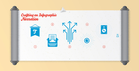
Crafting an infographic narrative is an art. We detail the five elements of an editorial infographic's narrative and what each element aims to accomplish. The best infographics are created when a story comes first. In a completed piece, every data point, piece of copy, and design element should support that story. This does not mean, however, that the story an individual or organization wants to tell will intuitively translate to the infographic medium. Even in instances where all information and data exists on paper, the story may still require adaptation—crafting an infographic narrative to effectively communicate the story. While specific needs vary across applications of infographics, for editorial pieces, this process typically involves writing titles, introductory paragraphs, callouts, and conclusions—the pieces that weave the story together. Via Lauren Moss
Scoop.it!
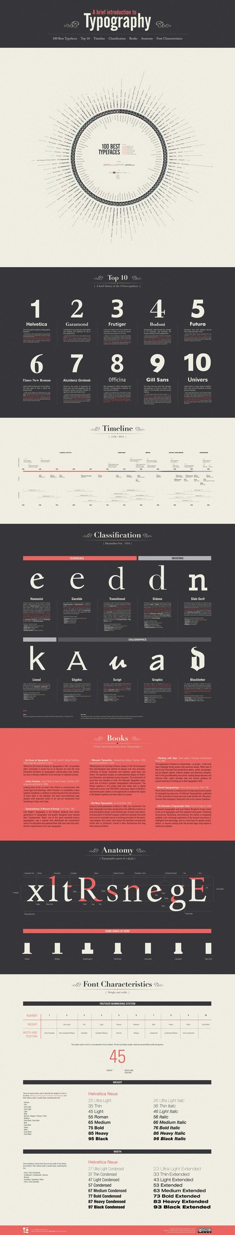
Typography is a key element of any graphic design. Any computer contains hundreds of pre-installed fonts to choose from and there are dozens of websites with thousands of free fonts, just some minimal knowledge and aesthetic taste.
This infographic intend to explain the basics of typography and disseminate the “best” ones that always work without too much complications. Take short walk through this fascinating world... Via Lauren Moss

Georgia Gibbs Design's curator insight,
April 19, 2013 8:05 PM
The lines in any face tell an interesting story and choosing the right type will help you to tell your own. 
Greg Andrade's curator insight,
October 11, 2013 10:09 PM
This is typography 101. These are some of the typography basics I teach my students. There are many other good articles pertaining to all types of design from architecture, furniture and of course graphic design.
Scoop.it!
From
ht

Let’s be honest, we don’t like to read big pieces of text. Text-heavy graphs are rather difficult for understanding, especially when dealing with numbers and statistics. That is why illustrations and flowcharts are often used for such kind of information. An infographic, or a visual representation of study or data, like anything else, can be done right or wrong. How to create a successful infographic? A good idea and a good design.
Stop by the link for more on what defines an infographic, what contributes to its popularity, as well as the various types of infographics and references for tutorials and best practices.
Additional topics covered include: The major parts of an infographic How to create an infographic Developing ideas & organizing data Research & sources Typography, graphics & color Facts & conclusions Designing & Editing Via Lauren Moss, Gust MEES
Scoop.it!

From vintage-themed photographs, to vibrant vector graphics, here's an infographic detailing the top global design trends of the year. After 8 years, 17 million images and over 200 million downloads, Shutterstock is one of the world’s leading marketplaces for visual media. We have artists and photographers from more than 100 countries, and customers in more than 150. But perhaps most significant about these milestones is that it has led to thousands of image searches each day – giving us valuable insight into design trends around the world. From vintage-themed photographs, to vibrant vector graphics, here’s an infographic detailing what visual stories were told over the last year. Via Lauren Moss
|


