The MarTech Digest
563.4K views | +0 today
Follow
Your new post is loading...
Scooped by Marteq
Scoop.it!

A Blueprint for the Perfect Popup: Structured Design for Unstructured Marketers - Unbounce

A Blueprint for the Perfect Popup: Structured Design for Unstructured Marketers - Unbounce | The MarTech Digest | Scoop.it
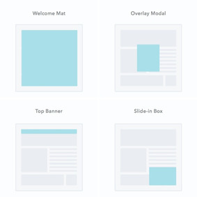
Is it possible to design the perfect popup? One so fiercely potent that people just can’t refuse to convert? The answer is YES, if you use my blueprint for the perfect popup design.
Marteq's insight:

A Blueprint for the Perfect Popup: Structured Design for Unstructured Marketers - Unbounce


BTW: Unbounce's pop-ups are a great add-on to their excellent product.


This news comes to you compliments of marketingIO.com. #MarTech #DigitalMarketing

No comment yet.
Scooped by Marteq
Scoop.it!

5 Real-Life Popup A/B Tests That Will Help Boost Your Conversion Rate - Crazy Egg

5 Real-Life Popup A/B Tests That Will Help Boost Your Conversion Rate - Crazy Egg | The MarTech Digest | Scoop.it
I’ll share 5 popup AB tests which can make a difference for your future and existing campaigns (spoiler: one of our customers almost tripled the number of emails they collected with a simple test).
Marteq's insight:

Your results will vary, but this is a great place to start.


Click/tap to view the original article.Click/tap to view the original article.This news comes to you compliments of marketingIO.com. #MarTech #DigitalMarketing

No comment yet.
Scooped by Marteq
Scoop.it!

The Complete Click Popup Blueprint (And How We Boosted Blog Conversion 33%) - Wishpond

The Complete Click Popup Blueprint (And How We Boosted Blog Conversion 33%) - Wishpond | The MarTech Digest | Scoop.it
Here’s a few rules we followed when crafting our new CTAs and popups:

  • Less is more: We drastically reduced the copy on the majority of our content upgrades. We found that if we were able to communicate benefit in the CTA itself, conversions on the popup didn’t decrease even when the popup itself had no copy.
  • Form mimics content: As you can see, we have two considerably different CTAs built using Wishpond. We did this to communicate the differences between our content upgrades. For our simple PDF content upgrades, we created a simple text-dominant CTA with a pink line to help them stand out to readers scrolling through a blog post. For our “bigger” gated content (like our Instagram Marketing Kit), we put together a brighter, more “complete” looking CTA to differentiate it from our normal content upgrades.
  • Separate call-to-action link within CTA: A CTA within a CTA? Instead of linking our entire CTA text to the popup, we created a new link saying something like “Get The Free Guide” to jolt viewers to attention and focus their intent.
  • Clean, simple design: Let’s be real - our old popups weren’t the prettiest things around. We cleaned up our design to give our new CTAs and popups a streamlined look that fit into our existing visual identity.
Marteq's insight:

Action: Click through to review the complete case study.


RYZZ is coming. It’s a new approach to MarTech for B2B Marketers.

#MarTech #DigitalMarketing

No comment yet.
Scooped by Marteq
Scoop.it!

Should Marketers Use Pop-Up Forms? A Comprehensive Analysis - HubSpot

Should Marketers Use Pop-Up Forms? A Comprehensive Analysis - HubSpot | The MarTech Digest | Scoop.it
The answer is yes. Pop-up forms do work, and this is the main reason so many marketers are using them.

But how much better do they perform than traditional forms? In one experiment, AWeber found that a pop-up form converted 1375% better than traditional forms for driving blog subscriptions (see the images below). In addition, according to research conducted by SumoMe, the top performing 10% of pop-up forms convert at a whopping 9.3%. Now I don't know about you, but an additional 9.3% conversion rate across my website sounds pretty good to me.

4 Tips for Crafting High-Converting Pop-ups
1) Offer something relevant and valuable.

2) Think about the way people engage with your pages.

3) Use language that's specific, actionable, and human.

4) Don't ruin the mobile experience.
Marteq's insight:

Well that settles it.


Email your comments to joe@marketingIO.com. I’ll publish it here. marketingIO: One Source for All Marketing Technology Challenges. See our solutions.  

No comment yet.
Scooped by Marteq
Scoop.it!

What 300 Million Pop-ups Taught Us About Email Signup Rates - SumoMe

What 300 Million Pop-ups Taught Us About Email Signup Rates - SumoMe | The MarTech Digest | Scoop.it

marketingIO: One Source for All Marketing Technology Challenges. See our solutions

Marteq's insight:

Some very creative ways to use SumoMe when you click through.

No comment yet.
Scooped by Marteq
Scoop.it!

How to Use an Exit-Popup Strategy to Grow Your Email List (Without Annoying Your Readers) - Profs

How to Use an Exit-Popup Strategy to Grow Your Email List (Without Annoying Your Readers) - Profs | The MarTech Digest | Scoop.it
Give them a way out

Before your exit popup does anything, it needs to give your visitors a way out. Most popups have the option to turn down the offer or close the window, but my favorite popups are those that have a tiny little note at the bottom saying, "You won't see this popup for the next 30/60/90 days".

Don't make them feel stupid

Negative CTAs don't need to be negative in nature. They just need to give an option to turn down the offer. Saying something that makes your reader question their decision to no sign up or guilts them into signing up is not a good marketing tactic.

Use it as a reminder

Sometimes, all an exit popup needs to do is remind visitors of your offer.

Make it a friendly "Hey, just making sure you saw this before you left."

Tell them something they don't know

Instead of giving them an offer or reminding them of it, tell them related information they won't find on the Web page they visited.

Surprise them with your offer

Be different and craft different offers for different Web pages and blog posts. It's simple, really. For every blog post, offer a related-content upgrade.
Marteq's insight:

Just be careful about the site pop-ups: don't drive people away.

No comment yet.
Scooped by Marteq
Scoop.it!

Landing Page Optimization: Simple pop-up overlay increases conversion 63% | MarketingExperiments | #TheMarketingAutomationAlert

Landing Page Optimization: Simple pop-up overlay increases conversion 63% | MarketingExperiments | #TheMarketingAutomationAlert | The MarTech Digest | Scoop.it
When it comes to how color use can impact the performance of a landing page, some of the least intuitive changes can produce a significant lift.


Summarized...


Background: Company provides educational resources for health and fitness professionals who subscribe to one of its online memberships

Goal: To increase the amount of free debt consolidation sign-ups without additional traffic

Primary Research Question: Which page will generate the highest completion rate?

Approach: A/B split test of three different versions of a homepage

Control: The research team hypothesized the main objective of the page was lost in all of the color design of the landing page.

Treatment: In one of the treatments, the team created a pop-up to eliminate all color distractions.

Marteq's insight:

That's a significant difference, and another justification for pop-ups, which when they first appeared were perceived as annoying, and now seen as the norm. You'll want to consider.


  • See the article at www.marketingexperiments.com
  • Receive a daily summary of The Marketing Automation Alert directly to your inbox. Subscribe here (your privacy is protected).
  • If you like this scoop, PLEASE share by using the links below.
  • iNeoMarketing drives more revenue and opportunities for B2B companies using marketing technologies. Contact us
No comment yet.