Lessons on making data useful from inside The New York Times.
Condensed...
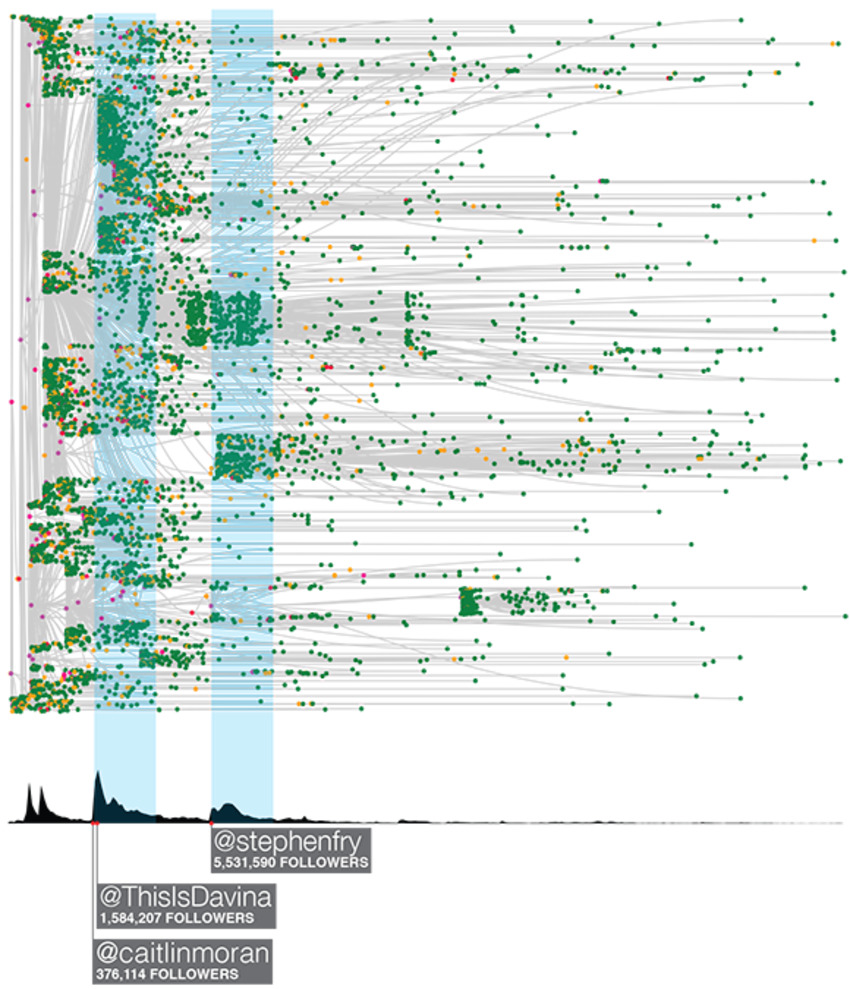
We are documenting every tweet, retweet, and click on every shortened URL from Twitter and Facebook that points back to New York Times content, and then combining that with the browsing logs of what those users do when they land at the Times. This project is a relative of the widely noted Cascade project. Think of it as Cascade 2.0.
We're doing this to understand and predict when an online cascade or conversation will result in a tidal wave of content consumption on the Times, and also when it won't. More importantly we are interested in how the word-of-mouth conversation drives readership, subscriptions, and ad revenue; how the Times can improve their own participation in the conversation to drive engagement; how we can identify truly influential readers who themselves drive engagement; and how the Times can then engage these influential users in a way that complements the users' own needs and interests. Do it, and we can turn that statistical analysis, as you'll see below, into elegant, artistic real time data streams.
Handling the streams, archiving the sessions and storing and manipulating the information are in themselves herculean tasks. But the even bigger challenge is transforming beautiful, big data into actionable, meaningful, decision-relevant knowledge. We've found that visualization is one of the most important guideposts in this search for knowledge, essential to understanding where we should look and what we should look for in our statistical analysis.
Still, the visuals cannot tell the whole story. We see some clear correlations here, but complex conditional dependencies and temporal and network autocorrelation make it necessary to build more sophisticated causal statistical models that will generate true, reliable insights about word-of-mouth influence.


 Your new post is loading...


In the forthcoming era of Big Data, is Data Visualization the first step? We've always collected, collated and analyzed the data, then created graphics to explain. Are graphics now the first step? Is this a way to use both sides of the brain to gain a greater understanding of what the data is telling us?
And can data lead to the creation of art?